Making my Nightfall game, one of the first things to do is to design a grid for the databattles. I’m going for 256 x 256 pixel dark blue squares on a light grey background. However, after making a mock-up in GIMP, I faced an unexpected usability problem. Can you see it?
It might not be visible to everyone, but when looking at that grid, I see light grey dots between the corners of the tiles. (it might help if you zoom in) It’s a Hermann grid illusion. It’s very distracting and not intentional, so I have to get rid of it.
I found this question on UX Stack Exchange. I tried several of the things suggested in the answers. Moving the squares closer together made the gaps between squares less obvious. Moving them further apart, I had to move them a large distance to get rid of the illusion, and that ruined the look of the grid. I couldn’t offset them, I have to keep them in line because of the format of the game. When I tried changing the colours, I couldn’t find a combination that worked well and didn’t have the illusion. Any combination with enough contrast to make the grid easily visible also produced the illusion.
I looked at how the original game does it. I don’t know if it’s deliberate, but it looks like it uses a combination of a patterned background and varying the colour of the squares to break up the illusion. It’s still visible to me if I look closely.

Varying the colour of the squares would make it harder to build levels, and I don’t really want to add a patterned background. I eventually found a different solution. I put another grid of small squares underneath, so that they fill the area between the corners:
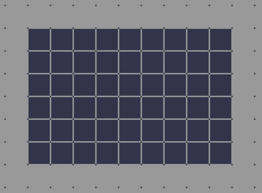
This eliminates the illusion, and has another advantage: Bit-Men. In The Nightfall Incident, the Bit-Man is a program you can use to add and remove squares from the grid. The small sub-grid makes it easier to see where Bit-Men will place new squares. This is my favourite solution by far.
